5 нейморфных компонентов дизайна в HTML, CSS и JavaScript
Неоморфизм – это новая тенденция дизайна, сочетающая плоский дизайн и скевоморфизм. Это минималистичный способ создания дизайна с использованием мягкого экструдированного пластика, почти стилизованного под 3D. В настоящее время этот дизайн популярен в Интернете и широко используется дизайнерами и разработчиками.
Если вы хотите опробовать неоморфизм для своего следующего проекта, вот несколько фрагментов кода, с которых можно начать.
1. Неуморфные карты
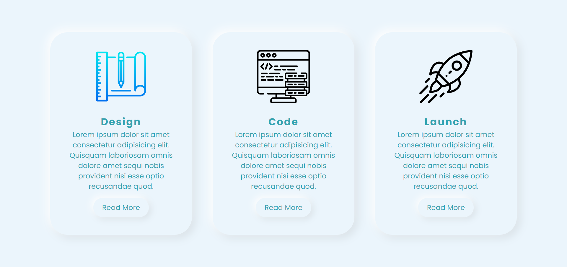
Используйте следующие фрагменты кода HTML и CSS для создания вышеуказанных неуморфных карточек.
HTML код
 <!DOCTYPE html>
 <html lang="en" dir="ltr">
 <head>
 <meta charset="utf-8">
 <title>Neumorphic Cards</title>
 <link rel="stylesheet" href="styles.css">
 </head>
 <body>
 <div class="container">
 <div class="card">
 <div class="imgBx">
 <img src="https://image.flaticon.com/icons/svg/2092/2092063.svg" alt="">
 </div>
 <div class="contentBx">
 <h2>Design</h2>
 <p>Lorem ipsum dolor sit amet consectetur adipisicing elit. Quisquam laboriosam omnis dolore amet sequi nobis provident nisi esse optio recusandae quod.</p>
 <a href=""><span>Read More</span></a>
 </div>
 </div>
 <div class="card">
 <div class="imgBx">
 <img src="https://image.flaticon.com/icons/svg/1197/1197460.svg" alt="">
 </div>
 <div class="contentBx">
 <h2>Code</h2>
 <p>Lorem ipsum dolor sit amet consectetur adipisicing elit. Quisquam laboriosam omnis dolore amet sequi nobis provident nisi esse optio recusandae quod.</p>
 <a href=""><span>Read More</span></a>
 </div>
 </div>
 <div class="card">
 <div class="imgBx">
 <img src="https://image.flaticon.com/icons/svg/1067/1067256.svg" alt="">
 </div>
 <div class="contentBx">
 <h2>Launch</h2>
 <p>Lorem ipsum dolor sit amet consectetur adipisicing elit. Quisquam laboriosam omnis dolore amet sequi nobis provident nisi esse optio recusandae quod.</p>
 <a href=""><span>Read More</span></a>
 </div>
 </div>
 </div>
 </body>
 </html>
Код CSS
 @import url('https://fonts.googleapis.com/css?family=Poppins:400,500,600,700,800,900&display=swap');
 *
 {
 margin: 0;
 padding: 0;
 box-sizing: border-box;
 font-family: 'Poppins', sans-serif;
 }
 body
 {
 display: flex;
 justify-content: center;
 align-items: center;
 min-height: 100vh;
 background: #ebf5fc;
 }
 .container
 {
 position: relative;
 display: flex;
 justify-content: space-around;
 align-items: center;
 flex-wrap: wrap;
 width: 1100px;
 }
 .container .card
 {
 width: 320px;
 margin: 20px;
 padding: 40px 30px;
 background: #ebf5fc;
 border-radius: 40px;
 box-shadow: -6px -6px 20px rgba(255,255,255,1), 6px 6px 20px rgba(0,0,0,0.1);
 }
 .container .card:hover
 {
 box-shadow: inset -6px -6px 20px rgba(255,255,255,0.5), inset 6px 6px 20px rgba(0,0,0,0.05);
 }
 .container .card .imgBx
 {
 position: relative;
 text-align: center;
 }
 .container .card .imgBx img
 {
 max-width: 120px;
 }
 .container .card .contentBx
 {
 position: relative;
 margin-top: 20px;
 text-align: center;
 }
 .container .card .contentBx h2
 {
 color: #32a3b1;
 font-weight: 700;
 font-size: 1.4em;
 letter-spacing: 2px;
 }
 .container .card .contentBx p
 {
 color: #32a3b1;
 }
 .container .card .contentBx a
 {
 display: inline-block;
 padding: 10px 20px;
 margin-top: 15px;
 border-radius: 40px;
 color: #32a3b1;
 font-size: 16px;
 text-decoration: none;
 box-shadow: -4px -4px 15px rgba(255,255,255,1), 4px 4px 15px rgba(0,0,0,0.1);
 }
 .container .card .contentBx a:hover
 {
 box-shadow: inset -4px -4px 10px rgba(255,255,255,0.5), inset 4px 4px 10px rgba(0,0,0,0.1);
 }
 .container .card a:hover span
 {
 display: block;
 transform: scale(0.98);
 }
 .container .card:hover .imgBx,
 .container .card:hover .contentBx
 {
 transform: scale(0.98);
 }
2. Неуморфная форма.
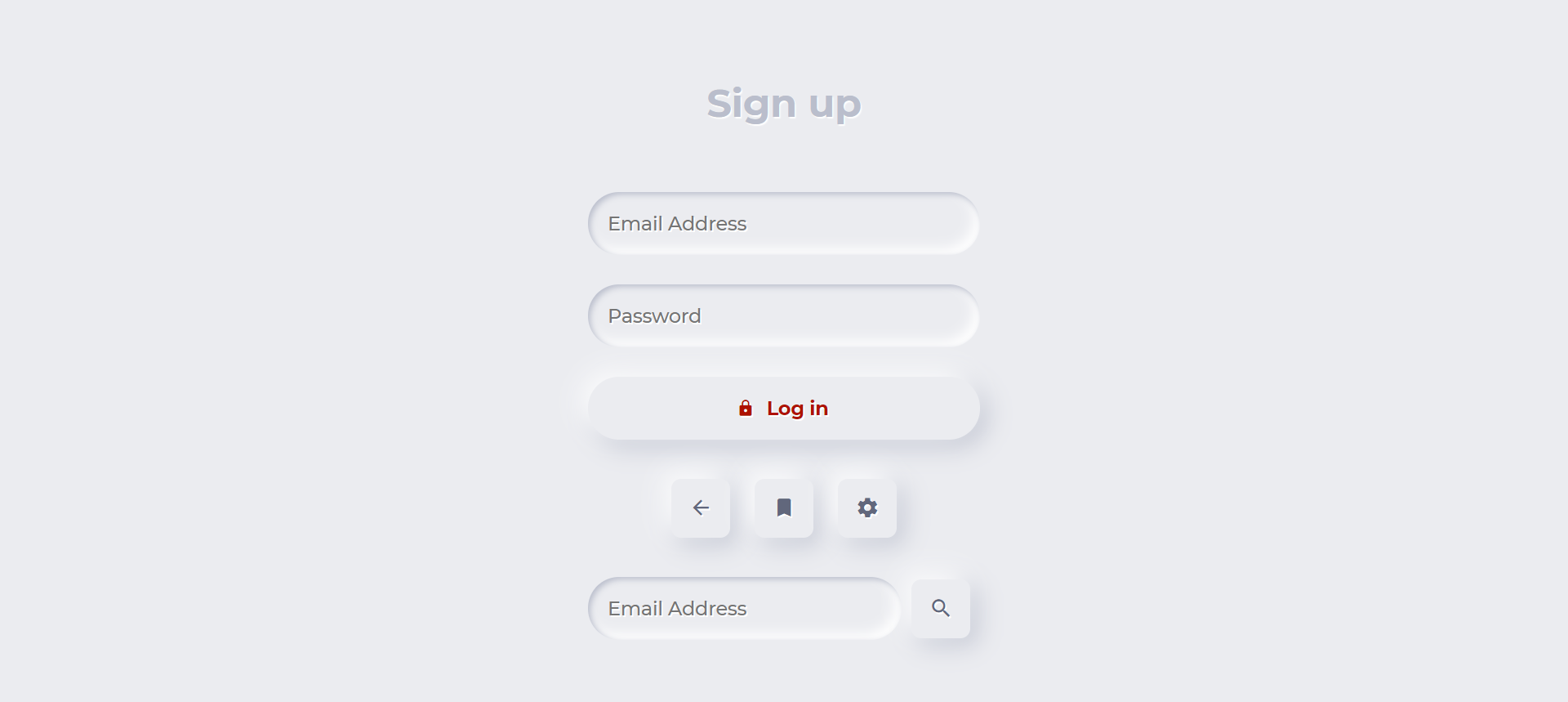
Используйте следующие фрагменты кода HTML и CSS, чтобы создать вышеупомянутую неуморфную форму.
HTML код
<!DOCTYPE html>
<html lang="en" dir="ltr">
<head>
<meta charset="utf-8">
<title>Neumorphic Form</title>
<link rel="stylesheet" href="https://unpkg.com/ionicons@4.5.10-0/dist/css/ionicons.min.css">
<style>
@import url('https://fonts.googleapis.com/css?family=Montserrat:500,700&display=swap');
</style>
<link rel="stylesheet" href="styles.css">
</head>
<body>
<form>
<div class="segment">
<h1>Sign up</h1>
</div>
<label>
<input type="text" placeholder="Email Address" />
</label>
<label>
<input type="password" placeholder="Password" />
</label>
<button class="red" type="button"><i class="icon ion-md-lock"></i> Log in</button>
<div class="segment">
<button class="unit" type="button"><i class="icon ion-md-arrow-back"></i></button>
<button class="unit" type="button"><i class="icon ion-md-bookmark"></i></button>
<button class="unit" type="button"><i class="icon ion-md-settings"></i></button>
</div>
<div class="input-group">
<label>
<input type="text" placeholder="Email Address" />
</label>
<button class="unit" type="button"><i class="icon ion-md-search"></i></button>
</div>
</form>
</body>
</html>
Код CSS
 body, html {
 background-color: #EBECF0;
 }
 body, p, input, select, textarea, button {
 font-family: "Montserrat", sans-serif;
 letter-spacing: -0.2px;
 font-size: 16px;
 }
 div, p {
 color: #BABECC;
 text-shadow: 1px 1px 1px #FFF;
 }
 form {
 padding: 16px;
 width: 320px;
 margin: 0 auto;
 }
 .segment {
 padding: 32px 0;
 text-align: center;
 }
 button, input {
 border: 0;
 outline: 0;
 font-size: 16px;
 border-radius: 320px;
 padding: 16px;
 background-color: #EBECF0;
 text-shadow: 1px 1px 0 #FFF;
 }
 label {
 display: block;
 margin-bottom: 24px;
 width: 100%;
 }
 input {
 margin-right: 8px;
 box-shadow: inset 2px 2px 5px #BABECC, inset -5px -5px 10px #FFF;
 width: 100%;
 box-sizing: border-box;
 transition: all 0.2s ease-in-out;
 appearance: none;
 -webkit-appearance: none;
 }
 input:focus {
 box-shadow: inset 1px 1px 2px #BABECC, inset -1px -1px 2px #FFF;
 }
 button {
 color: #61677C;
 font-weight: bold;
 box-shadow: -5px -5px 20px #FFF, 5px 5px 20px #BABECC;
 transition: all 0.2s ease-in-out;
 cursor: pointer;
 font-weight: 600;
 }
 button:hover {
 box-shadow: -2px -2px 5px #FFF, 2px 2px 5px #BABECC;
 }
 button:active {
 box-shadow: inset 1px 1px 2px #BABECC, inset -1px -1px 2px #FFF;
 }
 button .icon {
 margin-right: 8px;
 }
 button.unit {
 border-radius: 8px;
 line-height: 0;
 width: 48px;
 height: 48px;
 display: inline-flex;
 justify-content: center;
 align-items: center;
 margin: 0 8px;
 font-size: 19.2px;
 }
 button.unit .icon {
 margin-right: 0;
 }
 button.red {
 display: block;
 width: 100%;
 color: #AE1100;
 }
 .input-group {
 display: flex;
 align-items: center;
 justify-content: flex-start;
 }
 .input-group label {
 margin: 0;
 flex: 1;
 }
3. Неуморфный навигатор
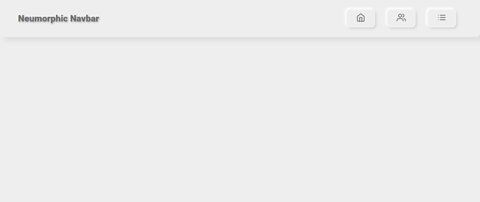
Используйте следующие фрагменты кода HTML, CSS и JavaScript, чтобы создать вышеупомянутую неуморфную панель навигации.
HTML код
<!DOCTYPE html>
<html lang="en" dir="ltr">
<head>
<meta charset="utf-8">
<title>Neumorphic Navbar</title>
<style>
@import url('https://fonts.googleapis.com/css?family=Roboto:400,900&display=swap');
</style>
<link rel="stylesheet" href="styles.css">
</head>
<body>
<ul class="nav">
<li class="logo">Neumorphic Navbar</li>
<li tabindex="0"><i data-feather="home"></i></li>
<li tabindex="0"><i data-feather="users"></i></li>
<li tabindex="0"><i data-feather="list"></i></li>
</ul>
<script src="https://cdnjs.cloudflare.com/ajax/libs/feather-icons/4.24.1/feather.min.js"></script>
<script type="text/javascript" src="script.js"></script>
</body>
</html>Код CSS
 * {
 margin: 0;
 padding: 0;
 box-sizing: border-box;
 }
 body {
 background-color: #efeeee;
 }
 .nav {
 width: 100vw;
 height: 100px;
 background-color: #efeeee;
 box-shadow: 10px 10px 12px 0 rgba(0, 0, 0, 0.07);
 border-radius: 0 0 10px 10px;
 display: flex;
 justify-content: flex-end;
 align-items: center;
 padding: 0 3rem;
 list-style-type: none;
 }
 .nav li.logo {
 margin-right: auto;
 font-family: "Roboto", sans-serif;
 font-size: 1.5rem;
 color: dimgray;
 font-weight: 900;
 text-shadow: 2px 2px 4px rgba(0, 0, 0, 0.3), -2px -2px 4px white;
 }
 .nav li:not(.logo) {
 margin: 0 1rem;
 padding: 0.5rem 1.5rem;
 border: 2px solid rgba(255, 255, 255, 0.3);
 box-shadow: 4px 4px 6px 0 rgba(0, 0, 0, 0.1), -4px -4px 6px white;
 border-radius: 10px;
 font-family: "Roboto", sans-serif;
 cursor: pointer;
 transition: color 0.2s ease-out, transform 0.2s ease-out;
 color: dimgray;
 }
 .nav li:not(.logo):hover {
 transform: scale(1.05);
 box-shadow: 4px 4px 10px 0 rgba(0, 0, 0, 0.1), -4px -4px 10px white;
 }
 .nav li:not(.logo):focus {
 outline: none;
 transform: scale(0.95);
 box-shadow: 4px 4px 10px 0 rgba(0, 0, 0, 0.1), -4px -4px 10px white, 4px 4px 10px 0 rgba(0, 0, 0, 0.1) inset, -4px -4px 10px white inset;
 }
 .nav li:not(.logo):hover, .nav li:not(.logo):focus {
 color: orangered;
 }
Код JavaScript
feather.replace();4. Неуморфный текст и формы.
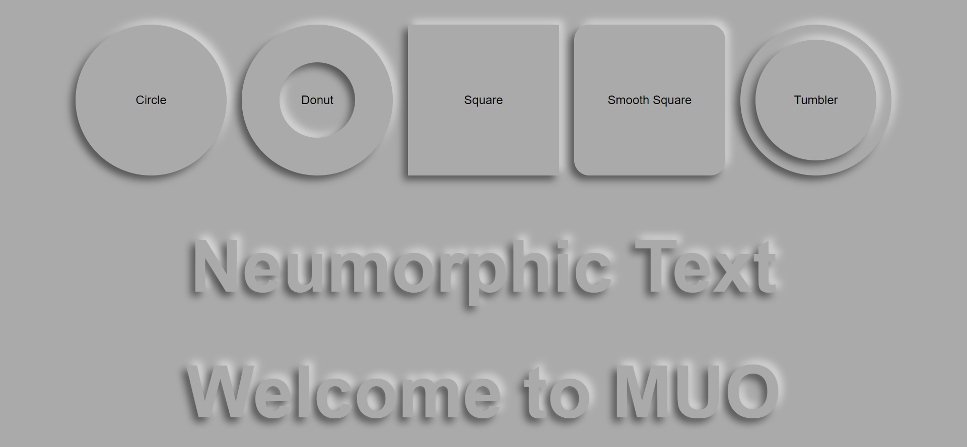
Используйте следующие фрагменты кода HTML и CSS, чтобы создать вышеупомянутый неуморфный текст и формы.
HTML код
 <!DOCTYPE html>
 <html lang="en" dir="ltr">
 <head>
 <meta charset="utf-8">
 <title>Neumorphic Text and Shapes</title>
 <link rel="stylesheet" href="styles.css">
 </head>
 <body>
 <div class="n-outset n-circle">Circle</div>
 <div class="n-outset n-donut"><div class="n-inset">Donut</div></div>
 <div class="n-outset n-square">Square</div>
 <div class="n-outset n-smooth-sq">Smooth Square</div>
 <div class="n-outset n-tumbler"><div class="n-outset">Tumbler</div></div>
 <div class="n-text">Neumorphic Text</div>
 <div class="n-text">Welcome to MUO</div>
 </script>
 </body>
 </html>
Код CSS
 *, *::before, *::after {
 box-sizing: border-box;
 }
 :root {
 --nColor: #aaa;
 --brShadow: -6px 6px 10px rgba(0,0,0,0.5);
 --tlShadow: 6px -6px 10px rgba(255,255,255,0.5);
 }
 body {
 margin: 0;
 font-family: sans-serif;
 min-height: 100vh;
 display: flex;
 align-items: center;
 justify-content: center;
 flex-wrap: wrap;
 background: var(--nColor);
 }
 .n-outset,
 .n-inset {
 display: flex;
 align-items: center;
 justify-content: center;
 }
 .n-circle {
 background-color: var(--nColor);
 box-shadow: var(--brShadow), var(--tlShadow);
 border-radius: 50%;
 width: 200px;
 height: 200px;
 margin: 10px;
 }
 .n-donut {
 background-color: var(--nColor);
 box-shadow: var(--brShadow), var(--tlShadow);
 border-radius: 50%;
 width: 200px;
 height: 200px;
 margin: 10px;
 }
 .n-donut .n-inset {
 background-color: var(--nColor);
 box-shadow: inset var(--brShadow), inset var(--tlShadow);
 border-radius: 50%;
 width: 50%;
 height: 50%;
 margin: 0;
 }
 .n-tumbler {
 background-color: var(--nColor);
 box-shadow: var(--brShadow), var(--tlShadow);
 border-radius: 50%;
 width: 200px;
 height: 200px;
 margin: 10px;
 }
 .n-tumbler .n-outset {
 background-color: var(--nColor);
 box-shadow: var(--brShadow), var(--tlShadow);
 border-radius: 50%;
 width: 80%;
 height: 80%;
 margin: 0;
 }
 .n-square {
 background-color: var(--nColor);
 box-shadow: var(--brShadow), var(--tlShadow);
 border-radius: 0;
 width: 200px;
 height: 200px;
 margin: 10px;
 }
 .n-smooth-sq {
 background-color: var(--nColor);
 box-shadow: var(--brShadow), var(--tlShadow);
 border-radius: 10%;
 width: 200px;
 height: 200px;
 margin: 10px;
 }
 .n-text {
 color: var(--nColor);
 text-shadow: var(--brShadow), var(--tlShadow);
 font-size: 6em;
 font-weight: bold;
 }
5. Неуморфные кнопки
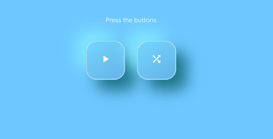
Используйте следующие фрагменты кода HTML, CSS и JavaScript для создания вышеуказанных неуморфных кнопок.
HTML код
 <!DOCTYPE html>
 <html lang="en" dir="ltr">
 <head>
 <meta charset="utf-8">
 <title>Neumorphic Buttons</title>
 <link href="https://fonts.googleapis.com/css?family=Quicksand&display=swap" rel="stylesheet">
 <link rel="stylesheet" href="styles.css">
 </head>
 <body>
 <div class="btn-holder">
 <p class="intro-text">Press the buttons</p>
 <button id="play-pause" onclick="changeStyle('play-pause')" aria-label="Play/Pause Button." class="btn neumorphic">
 <span class="icon">
 <i id="play" class="material-icon">
 play_arrow
 </i>
 <i id="pause" class="material-icon">
 pause
 </i>
 </span>
 </button>
 <button id="shuffle-btn" onclick="changeStyle('shuffle-btn')" aria-label="Shuffle Button." class="btn neumorphic">
 <i id="shuffle" class="material-icon">
 shuffle
 </i>
 </button>
 </div>
 <script type="text/javascript" src="script.js"></script>
 </body>
 </html>
Код CSS
 @import url('https://fonts.googleapis.com/icon?family=Material+Icons');
 body{
 background-color: #6ec7ff;
 }
 .btn-holder{
 display: block;
 margin: 0 auto;
 margin-top: 64px;
 text-align: center;
 }
 .intro-text{
 margin-bottom: 48px;
 font-family: 'Quicksand', sans-serif;
 color: white;
 font-size: 18px;
 }
 .btn{
 width: 110px;
 height: 110px;
 font-size: 30px;
 border-radius: 30px;
 border: none;
 color: white;
 vertical-align: top;
 -webkit-transition: .6s ease-in-out;
 transition: .6s ease-in-out;
 }
 .btn:hover{
 cursor: pointer;
 }
 .btn:focus{
 outline: none;
 }

 .btn:first-of-type{
 margin-right: 30px;
 }

 .neumorphic{
 background: linear-gradient(145deg, #76d5ff, #63b3e6);
 box-shadow: 30px 30px 40px #1e7689,
 -30px -30px 40px #7fe5ff;
 border: 3px solid rgba(255, 255, 255, .4);
 }
 .neumorphic-pressed{
 background: linear-gradient(145deg, #63b3e6, #76d5ff);
 -webkit-box-shadow: inset 15px 15px 20px -20px rgba(0,0,0,.5);
 -moz-box-shadow: inset 15px 15px 20px -20px rgba(0,0,0,.5);
 box-shadow: inset 15px 15px 20px -20px rgba(0,0,0,.5);
 }
 .neumorphic:focus, .neumorphic:hover, .neumorphic:focus, .neumorphic:hover, .neumorphic-pressed:focus, .neumorphic-pressed:hover {
 border: 3px solid rgba(46, 74, 112, .75);
 }

 .material-icon {
 font-family: 'Material Icons';
 font-weight: normal;
 font-style: normal;
 font-size: 32px;
 display: inline-block;
 line-height: 1;
 text-transform: none;
 letter-spacing: normal;
 word-wrap: normal;
 white-space: nowrap;
 direction: ltr;
 -webkit-font-smoothing: antialiased;
 text-rendering: optimizeLegibility;
 -moz-osx-font-smoothing: grayscale;
 font-feature-settings: 'liga';
 }
 #pause {
 color: #143664;
 display: none;
 }
Код JavaScript
 function changeStyle(btnPressed) {
 var btn = document.getElementById(btnPressed);
 btn.classList.toggle("neumorphic");
 btn.classList.toggle("neumorphic-pressed");
 if (btnPressed === 'play-pause') {
 play();
 } else if (btnPressed === 'shuffle-btn') {
 shuffle();
 }
 }
 function play() {
 var playBtn = document.getElementById('play');
 var pauseBtn = document.getElementById('pause');
 if (playBtn.style.display === 'none') {
 playBtn.style.display = 'block';
 pauseBtn.style.display = 'none';
 } else {
 playBtn.style.display = 'none';
 pauseBtn.style.display = 'block';
 }
 }
 function shuffle() {
 var shuffleBtn = document.getElementById('shuffle-btn');
 if (shuffleBtn.style.color == 'white' || shuffleBtn.style.color == '') {
 shuffleBtn.style.color = '#143664';
 } else {
 shuffleBtn.style.color = 'white';
 }
 }
Если вы хотите взглянуть на полный исходный код, использованный в этой статье, вот репозиторий GitHub .
Примечание . Код, использованный в этой статье, лицензирован MIT .
Оформите свой сайт с помощью неоморфизма
Вы можете использовать минималистичную дизайнерскую концепцию неоморфизма для стилизации своего сайта. Обеспечивает эстетичный вид. Но все же неуморфизм имеет ограничения доступности.
Есть разные способы придать веб-сайту элегантный вид. Если вы хотите стилизовать мягкие блоки на своем веб-сайте, попробуйте свойство CSS box-shadow.